You have been reading one side’s numbers.
Most coverage states a casualty figure as fact. It came from somewhere, and the somewhere has an interest. This shows both sides, and the independent estimate, and says on the page which is which.
10 ongoing wars, read in your browser. Every figure carries who said it, when, and whether anyone independent agrees.
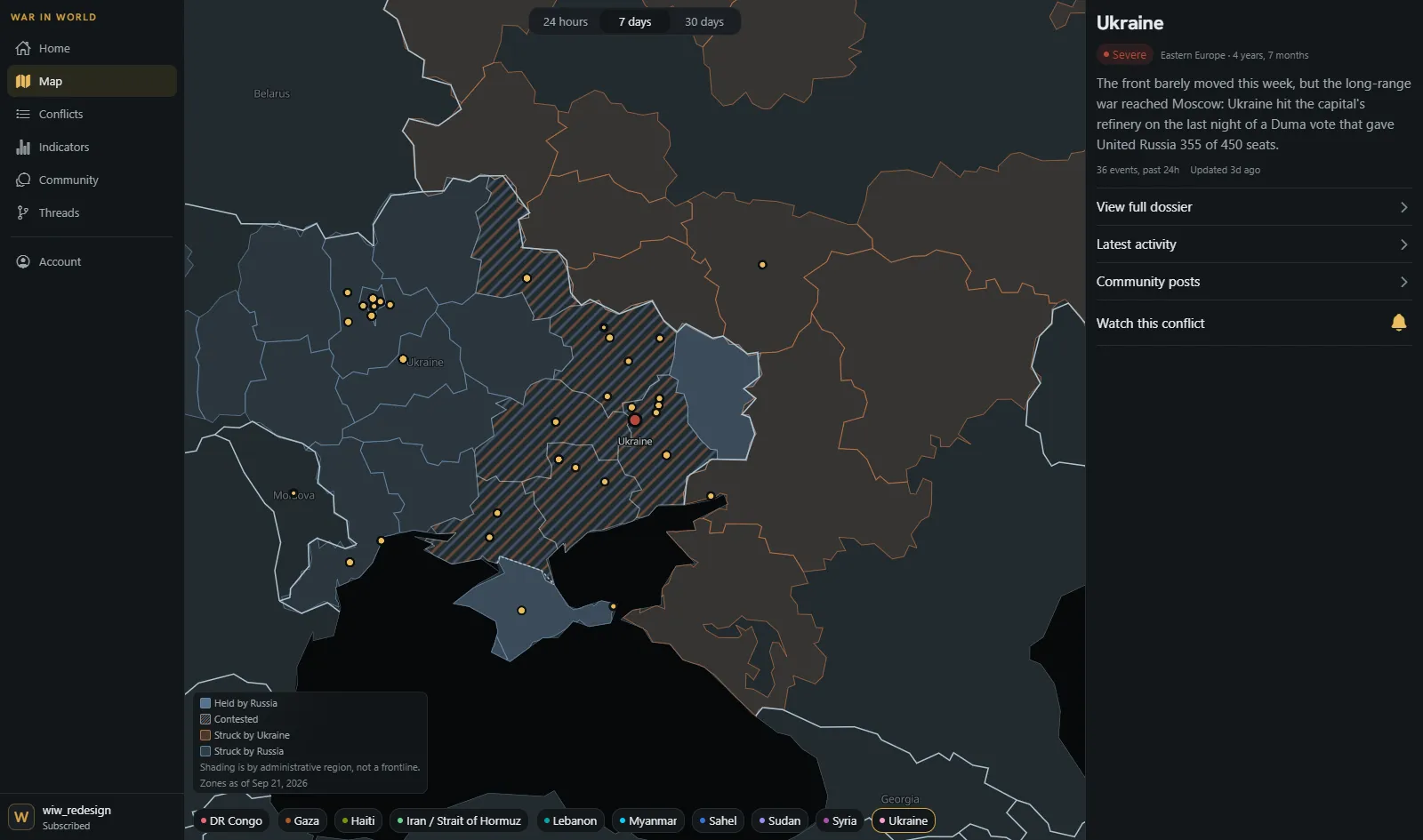
A real figure from the app, with its real sources. Not an illustration of the idea: the idea itself, rendered the way a subscriber sees it.
Contested figure
Ukraine
Russian military deaths since 24 Feb 2022
Russia
Russia has published no figures for its own losses since September 2022, when its defence minister put the death toll at just under 6,000.
As of Feb 24, 2026
The Moscow TimesIndependent
239,354 personnel
As of Aug 13, 2026
Mediazona / BBC Russian — dead confirmed by name, a floor not a totalNo ratio is printed between a published number and a missing one. That would invent a disagreement Russia has never stated. The empty column is the finding, and it carries a source for the silence like everything else does.
Most coverage states a casualty figure as fact. It came from somewhere, and the somewhere has an interest. This shows both sides, and the independent estimate, and says on the page which is which.
Russia has published no figure for its own dead since September 2022. Most trackers show a blank there, or quietly drop the column. This one says so, and cites a source for the silence.
The Sahel, Myanmar, DR Congo and Haiti get almost no coverage anywhere. If you only read headlines, four of these are invisible to you.
Not a news app for the commute. A reference for someone who wants to check a claim, compare two sources, and see how a figure moved.
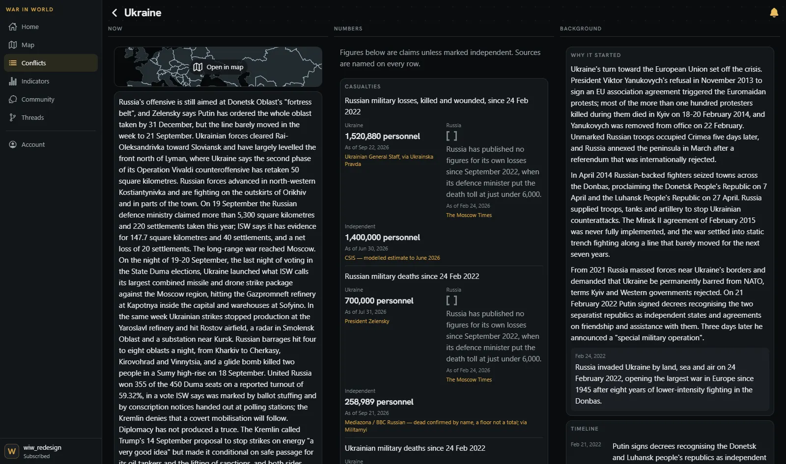
The browser build puts the three things you would otherwise tab between side by side: the current state of a war, its contested figures, and how it got here. 187 figures across the 10 dossiers, each one with a source name and an as-of date attached to it in the database rather than in a caption.
Underneath that: a weekly brief drawn only from what has already been reported and cited, Threads that connect events within a war and are verified before publication, and Indicators, which is 29 dated political events alongside commodity series running back to 1987.
No trial, no free tier, and no introductory rate that becomes something else in ninety days. Both prices stand indefinitely.
It is priced this way because the alternative is advertising, and an outlet whose revenue depends on attention reports on a war differently. There are no ads here and no sponsor, and nothing about you is sold.